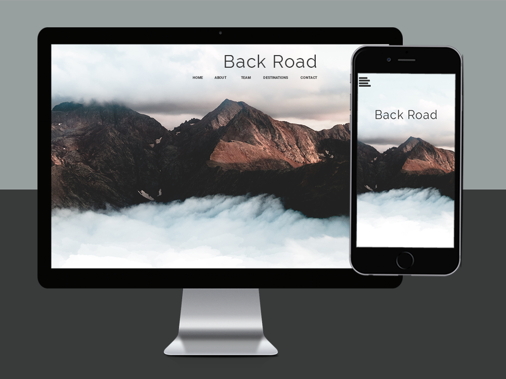
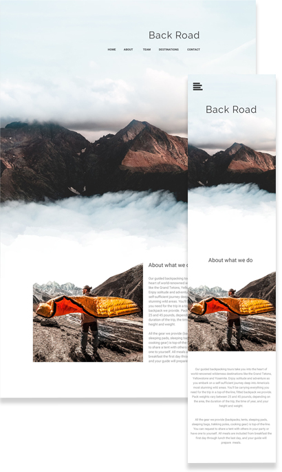
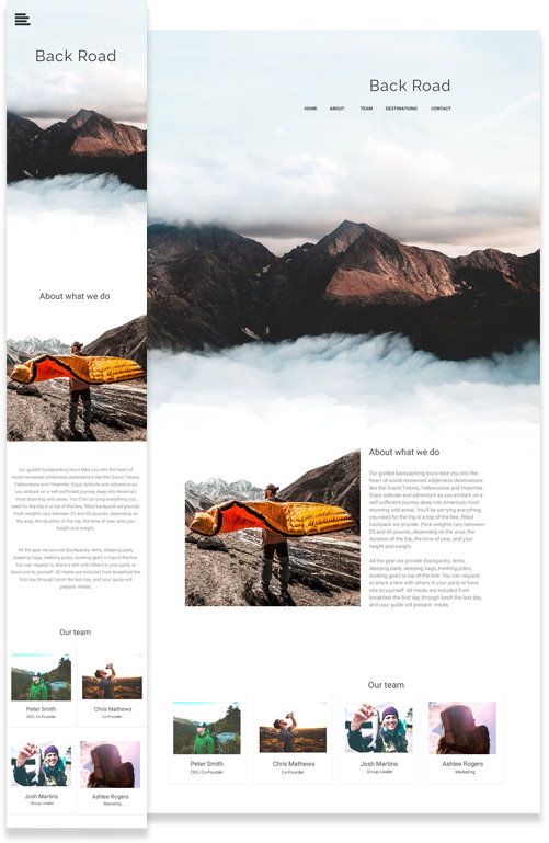
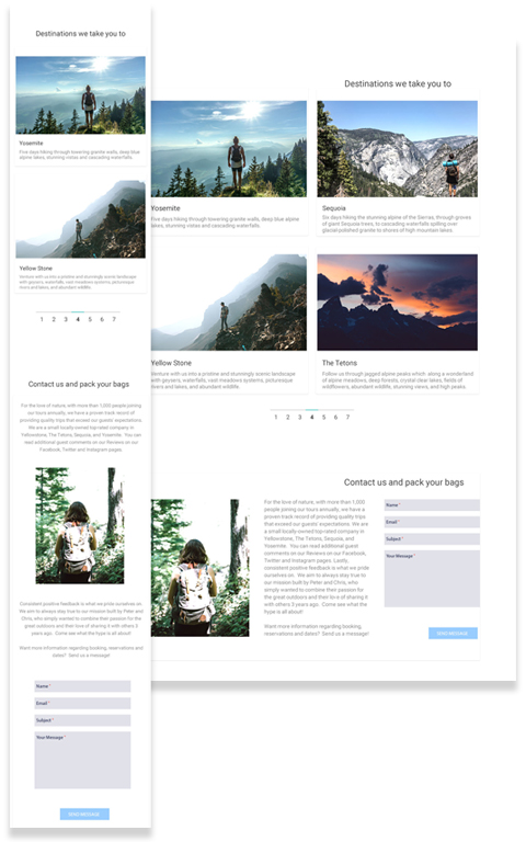
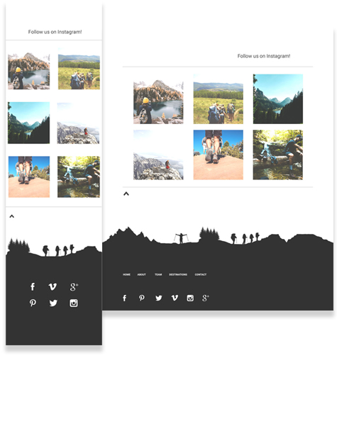
Back Road
A look at the thought process | While traveling up the West Coast, I bumped into this fun team in Bend, Oregon. All for the love of nature, their company is a small family run one that offers guided backpacking tours which take clients into the heart of world-renowned wilderness destinations like the Grand Tetons, Yellowstone and Yosemite where they can find solitude and adventure while visiting America's most stunning wild areas. They simply combined their passion for the great outdoors and their love of sharing it with others to build their small company, and have so much to offer but had yet to launch a company website. This group of people inspired me so much that I wanted to return the favor. The Back Road team are out door enthusiasts and out of the box thinkers. I wanted their website to emulate this by taking the user experience to the next level, combining parallax animation effects and cloud pixels of varying opacity values.
Identifying Challenges | I wanted this design to be different, unstructured and flexible. Sticking to a grid and proportioned dimensions are important components of design, but I really wanted to give the user the experience that they were climbing a peak, at least in a visual sense. I wanted this design to be boundary free and all part of one large view.
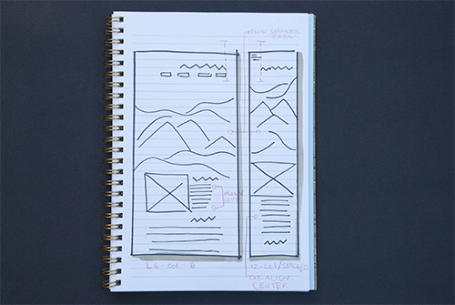
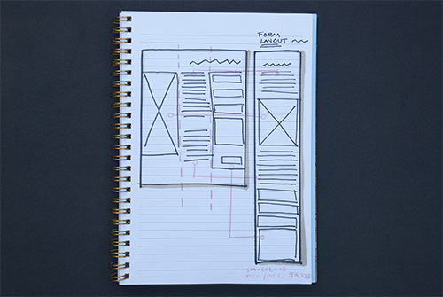
Design Thinking, Planning and Wireframing | Moving into layout and sketching for this site was unique. I wanted to step outside of the box with this one, in hopes of representing the creative culture of this small company and to set them apart from competitors. I didn't just want use flexible and responsive design principles between devices, I wanted to use this concept throughout the entire design to create a seamlessly fluid feel.
Key Color Themes & Design Layout | Personally I love mountains and the natural environment, and what I love the most about natural landscapes is the stark contrast in colors and inherently minimalist style. Dark mountains with bright wild flowers, light snow covered mountain peaks and bright green trees, or bright blue alpine lakes and dark grey rocks. These are the things that inspired this design and what I wanted to try to represent in the branding process. I took my favorite mountain top pictures and pulled them into Photoshop, sampling each hex code color number and playing with different combinations. With a grid and dimensions keeping my design structured, I was able to give the user a visual sense that this site is abstract, unaligned and fluid.

Product | The page starts off with a value proposition of no words, only a large showcase hero image of the top of a high peak where the user can imagine standing above the clouds. As the user scrolls down the page, they are taken seemingly through explainations of what the company does and who they are. In terms of development, I designed this with parallax scrolling animation effects in mind, leaving the user with the sense that they are moving back down the mountain. This experience allows users to feel different, as if they are there, in person, taking in the view.
Lessons Learned | The less traditionally I design, the more fun I have. It is possible to design abstractly but stick to the grid layout principles of responsive web design.
projects