Travlyr
A look at the thought process | The goal was to create a platform which would help facilitate safe in person get-togethers quickly and easily for travelers based on location and possibly common interests. It started from the idea that it can be tough meeting other rag-tag travelers while backpacking alone. Another bonus of locating other travelers would be identifying places worth stopping to eat or drink at. But would travelers feel more trusting and relaxed meeting new people while traveling if they were able to pick and view them first? This was something I hoped the UX process would help identify.
Identifying Challenges | How can strangers be brought together in an unfamiliar setting and feel safe, as if they were meeting up with an old friend.
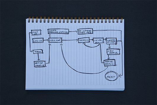
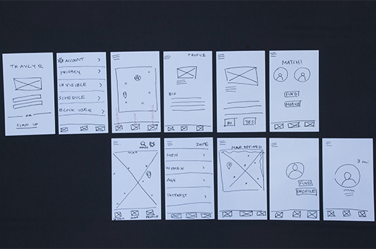
Design Thinking, Planning and Wireframing | Next comes the development of content to work with. First I set out to identify the ideal user journey and the path of least resistance with service blueprints. This helped kickstart some low fidelity sketches, primarily used for mapping and flow processes. This helped identify gaps, understand user goals and aid in simplification. Sketching out thoughts and a user flow allowed me enough content to move into digital wireframing in Omnigraffle for quick prototyping.
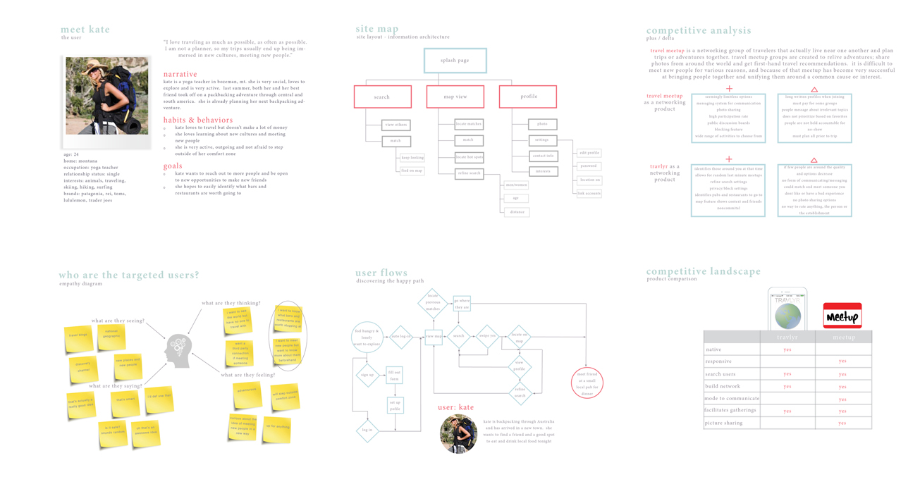
Ethnographic Research & User Testing | This stage involved a lot of interviews with target users, the development of a persona, the creation of empathy diagrams, competitive analysis, competitve landscape product comparison, and continued user testing.
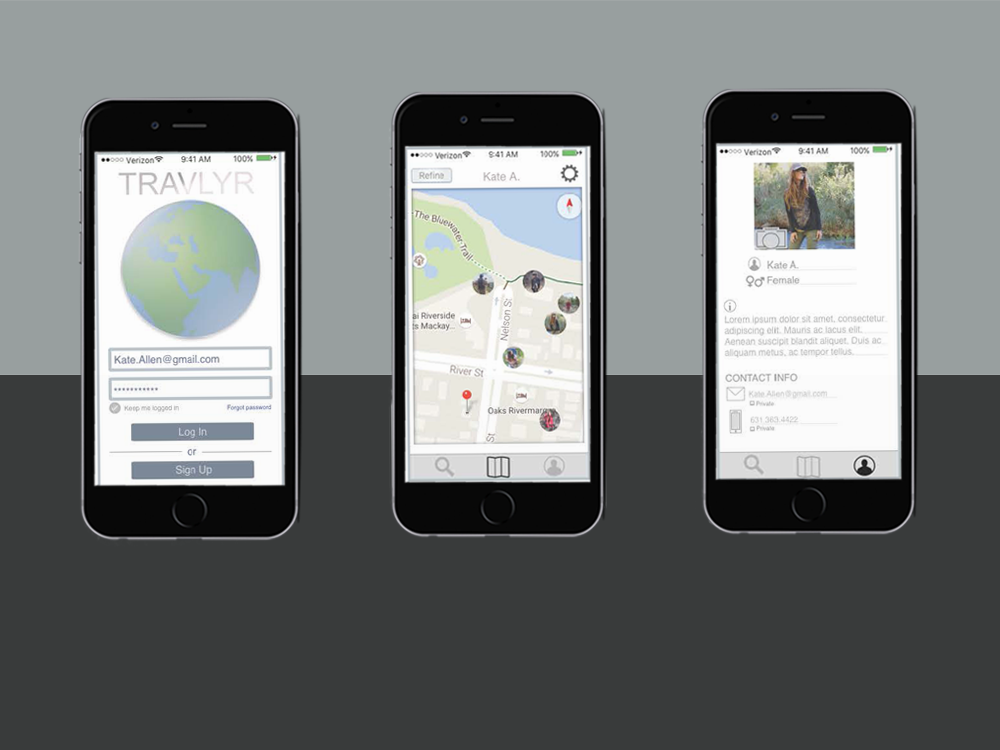
Key Color Themes & Design Layout | I wanted to keep the colorful user interface components and design aesthetic minimal. I experiment with colors and pixels, taking inspiration from outside landscapes and urban settings. As always, this phase is shaped by dimensions and a grid.

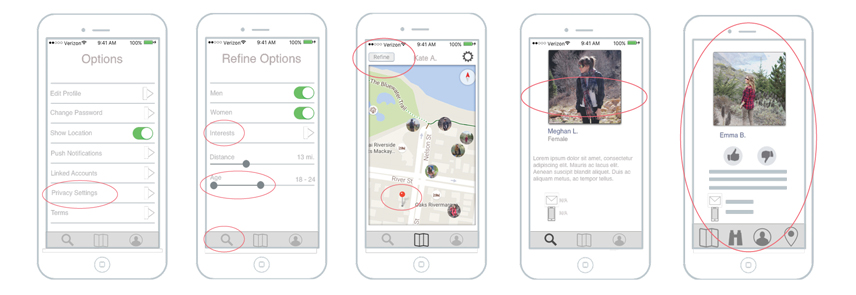
Iterations Continue | As user testing was a constant throughout this entire process, it was inevitable that different variations would be needed. It was at this stage that features were removed from the blueprint, and prioritizing features was the focus.
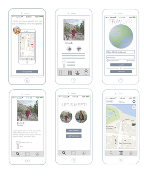
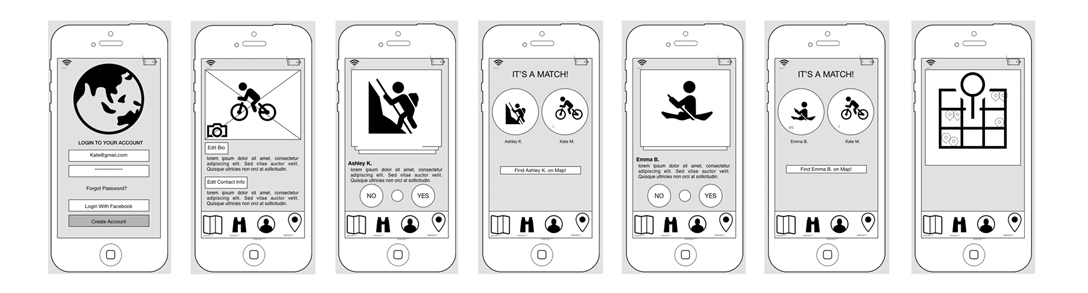
Product | This product was only taken as far as mid-level wireframing, as seen below. With the inconsistent feedback from user interviews and surveying, it was decided by the investors that is was not worth taking into the final high-fidelity stage, one step away from development.

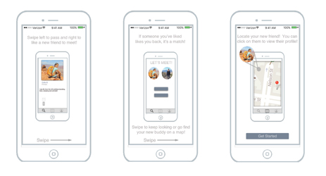
On Boarding | Always a fun challenge, exposing the user enough to educate without losing their interest. This was the final stage of the design process.
Ending Note | This project was the most user testing heavy process I have ever been a part of. Because of that, the investors got cold feet and pulled out. I think there needed to be a stronger balance between user research, market research, competitive research and moving forward with design and development.
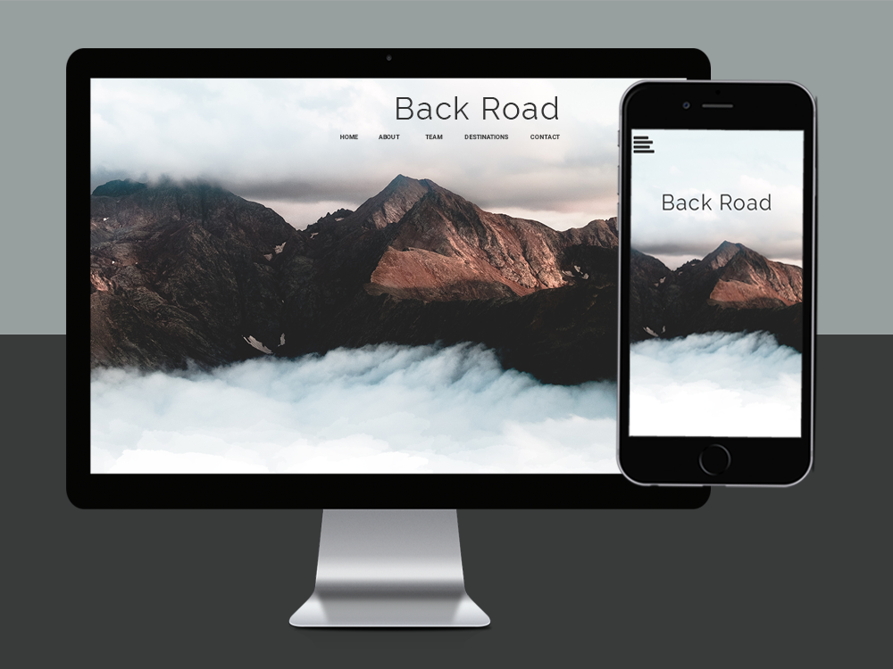
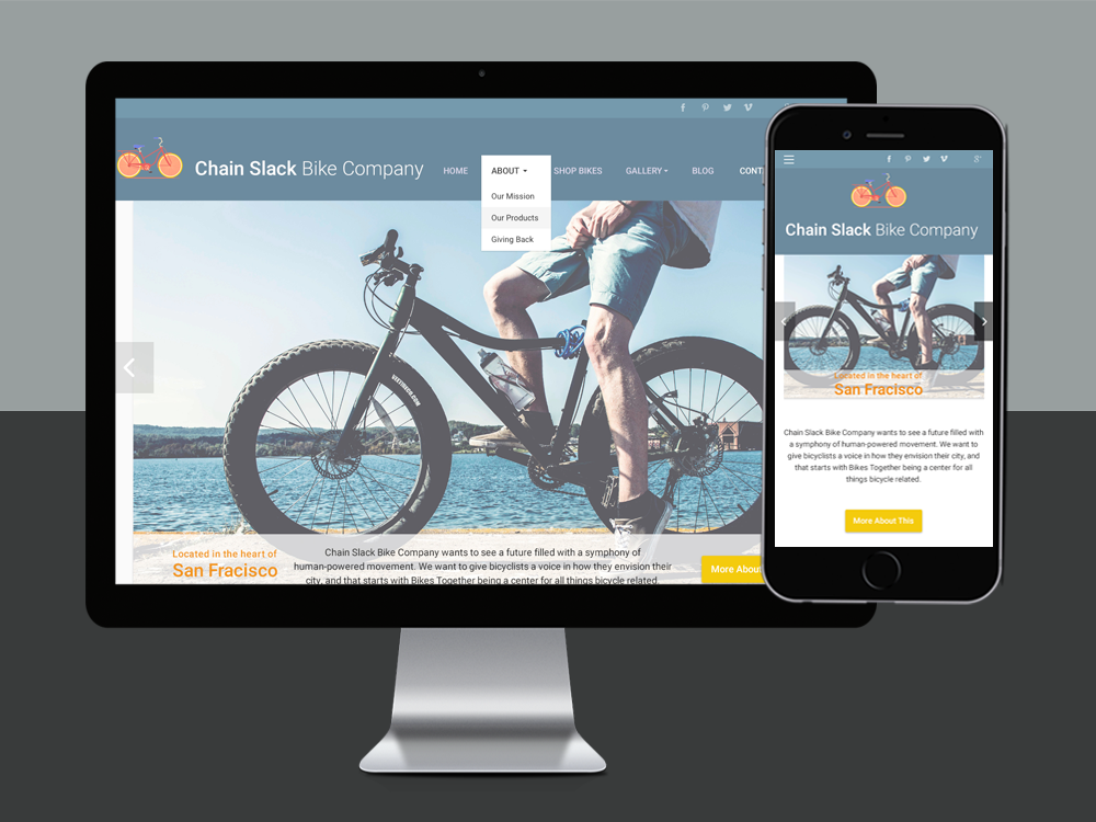
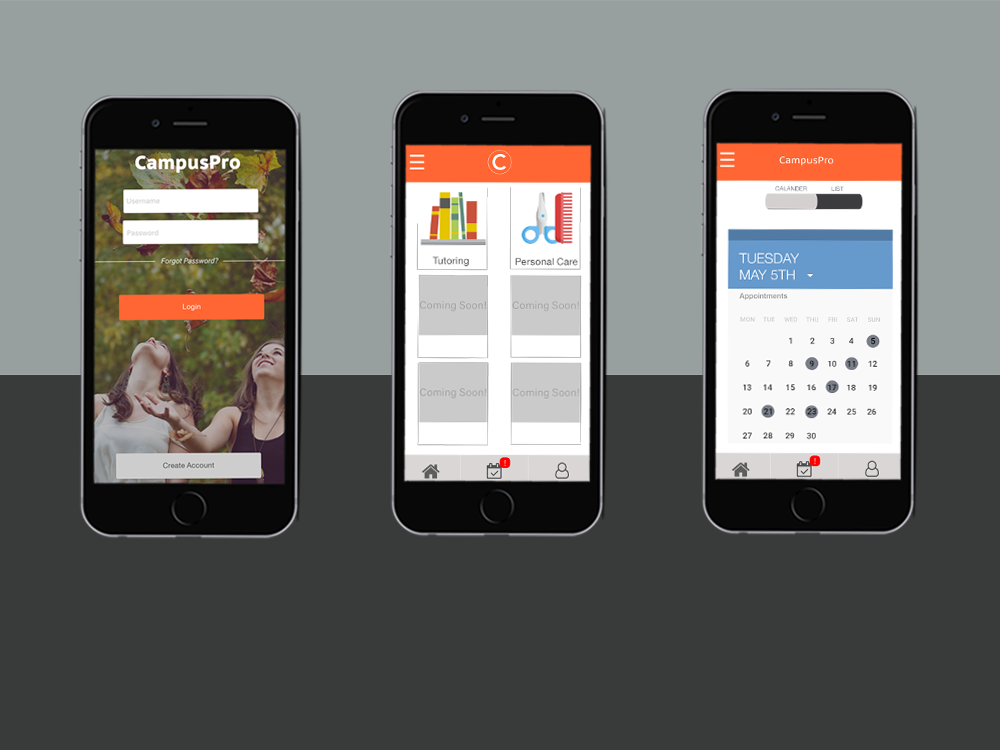
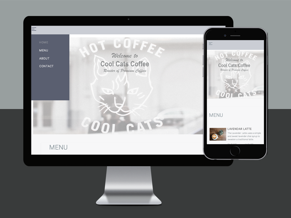
projects