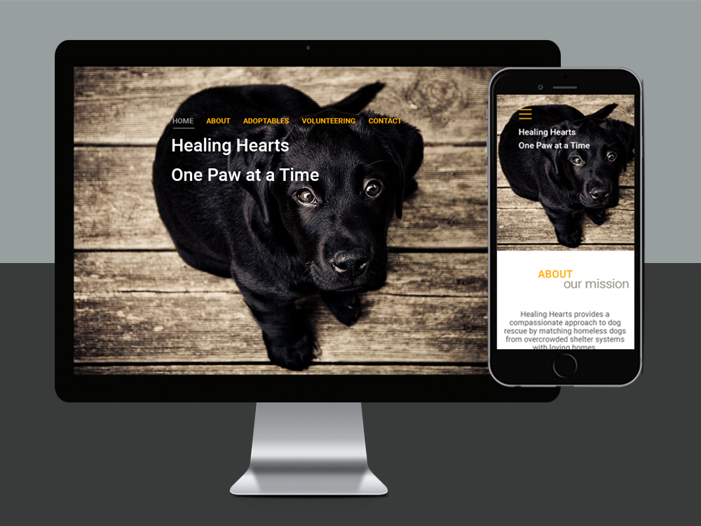
Healing Hearts
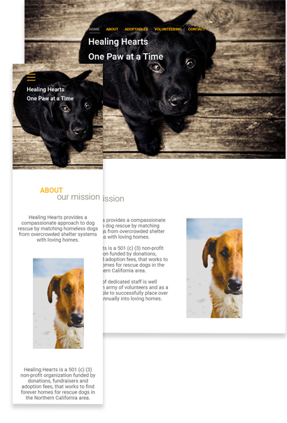
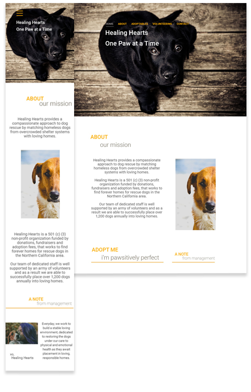
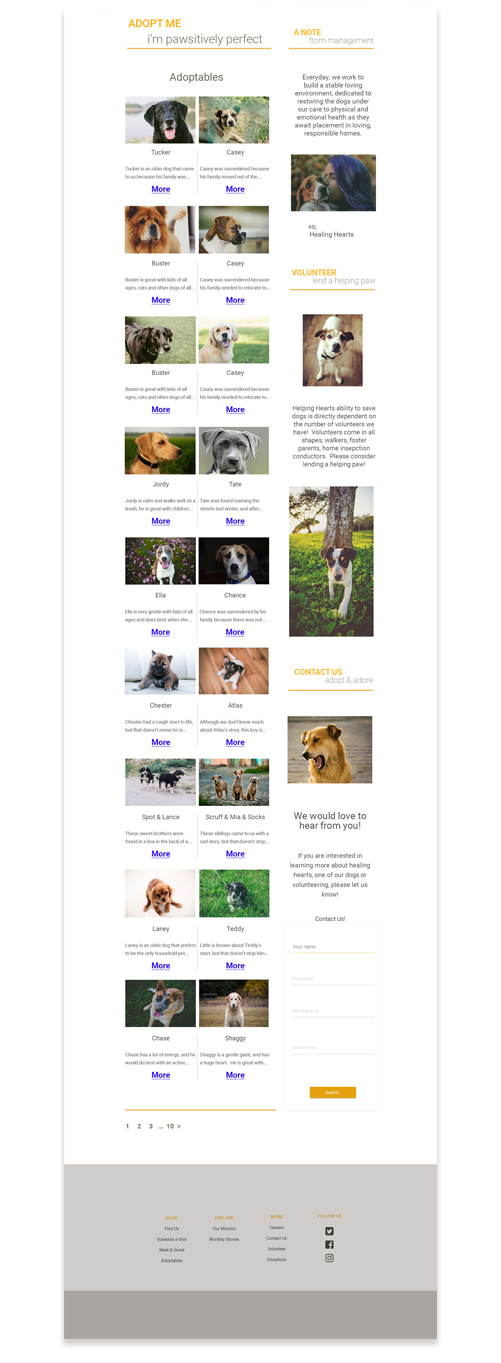
A look at the thought process | I knew when taking this project on, I needed to target user empathy. Who doesn't love puppies? Designing this site for a nonprofit was a fun undertaking and an awesome experience. People don’t start off reading websites, they scan them. So I knew the way to capture the hearts of the viewers was through showcasing images promoting the adoptables and all of the things that make this organization so amazing.
Identifying Challenges | The team at Healing Hearts really wanted to keep the site to a one page experience. This presented several challeges due to content overload and space restrictions. Because of this, I adopted a two-column home page and dove right into designing and planning layout for a CSS Flexbox approach.
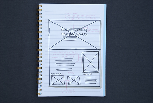
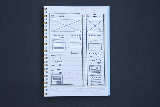
Design Thinking, Planning and Wireframing | Next, I started developing service blueprints and sketches to show the team. These involved several layout options for both website and mobile. A flexible or fluid design is a great way of ensuring that all the images will fill the screen nicely on any sized mobile device, which is very important for the featured adoptables.
Key Color Themes and Design Layout | Once the user journey was set, it was time to get creative with colorful user interface components and branding. Although I love bright colorful designs, in this case I opted for design aesthetics to be minimal, and to keep a strong focus on content and images. The colors I went with are neutral, but speak to the cause and product. Photoshop is the next step to begin experimenting with colors and pixels, grabbing inspiration from my development concept. Per usual, I focused on site layout with my mind on dimensions, pixels and to switch it up the CSS Flexbox classes instead of a twelve column bootstrap grid.

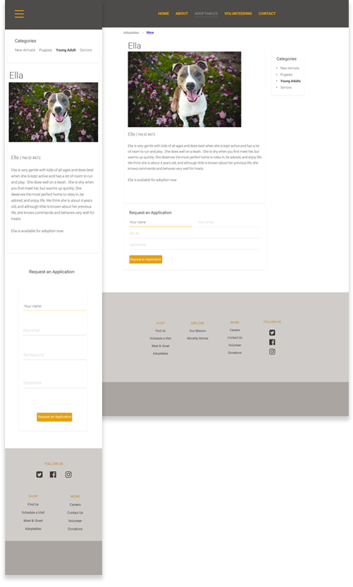
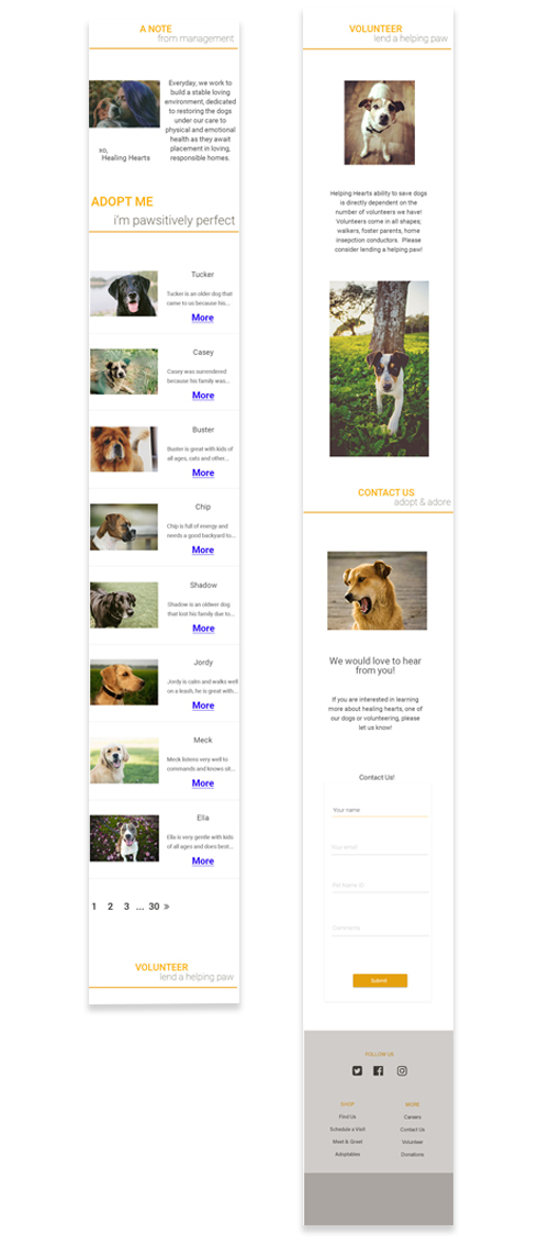
Product | I set a breakpoint at 700px width, as this is the point at which the desktop gets squashed. The width becomes flexible below this point rather than simply jumping to a fixed 320px width which I was able to do using Flexbox classes in CSS. I wanted those adorable dog faces to market themselves, and take up at a minimum half of the allotted surface space on even the smallest of devices. On web, I kept the important content in a sidebar column to the right, and on mobile I designed the layout with both push and pull grid classes and Flexbox classes in mind. As per client request, the only time the user is taken off of the main Home page is to view a specific pup.
Lessons Learned | The most important lesson I took away from this project is to leave the CSS classes float and clearfix behind and adopt the Flexbox method for complicated layouts. Also, never underestimate the power of user empathy.
projects