Title Design
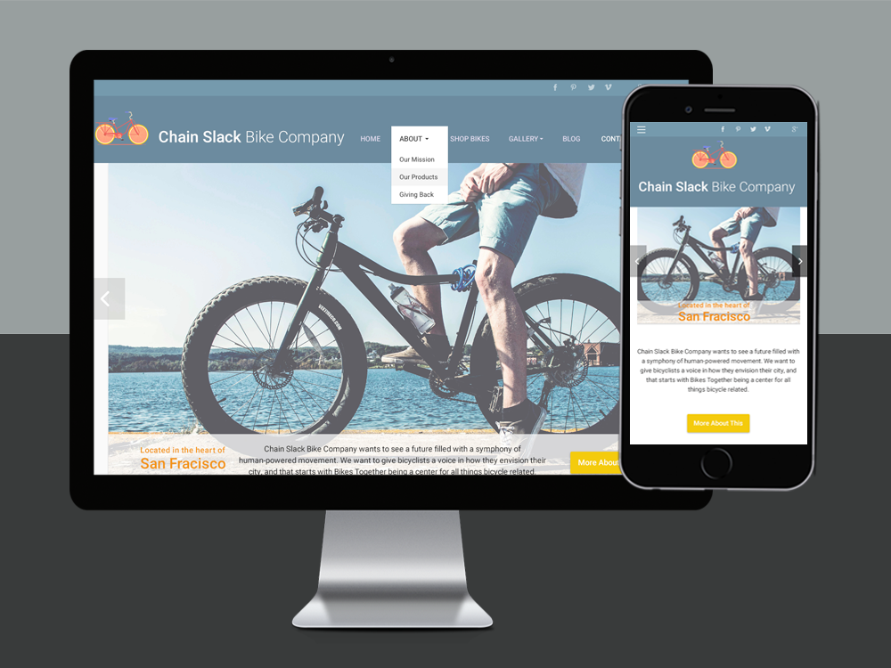
A look at the thought process | With a motto "Every butt on a bike", this small company has a lot of personality that I wanted channel into my design. The most notable thing about this company is there passion for community and health. They believe in getting people on bikes and keeping them there, for both a viable means of transportation and as a means to address health disparities that exist in the community. They strive to empower individuals to take control of their transportation, health, and get outside and these are the principles I wanted to emulate in my design.
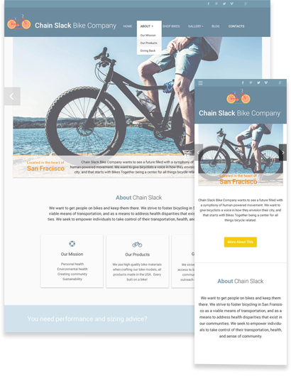
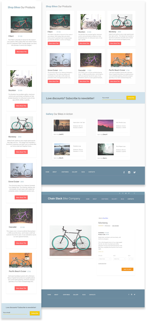
Identifying Challenges | I wanted to make sure my design accuratly resprested the high quality bike materials and model products. I needed to prioritize important product page elements such as images, price, product variations, add-to-cart buttons and customer ratings. Product descriptions are important, but product pages should really be image focused, with a feature focus if possible. What makes each bike differ from one another? All things to consider, but I was up for the challenge.
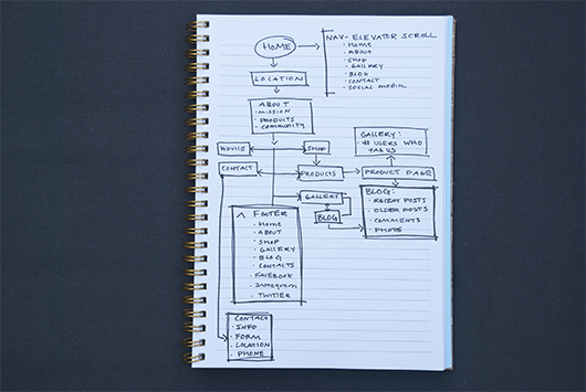
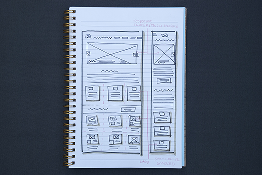
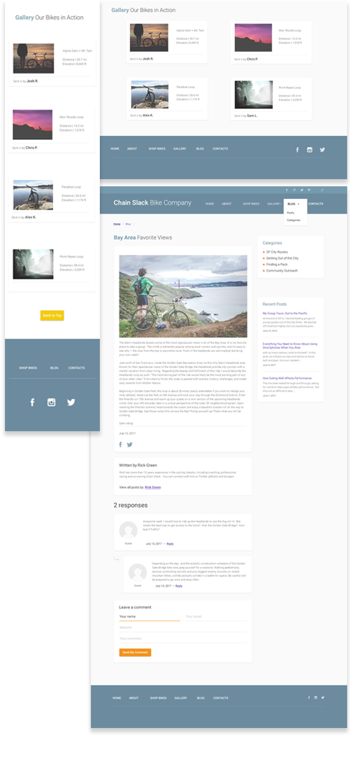
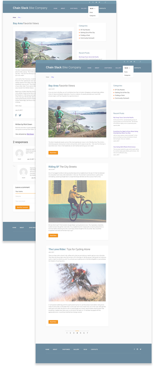
Design Thinking, Planning and Wireframing | I started off optimizing my product product page layout to promote as many sales as possible. I decided to move the user off of the home page to a product page, where I designed a layout that works well for products that focus on specifications and functionality rather than the aesthetics. I feel that placing a full-width product image across the product page guides customers to focus on the beauty of each product. This allowed me to keep my home page looking as beautiful as possible. One final piece to this puzzle was linking up to the company blog, which is how they manage their community outreach so successfully. Their blog offers advice, and information on bike routes while giving community members a platform to communicate about certain trails or group rides.
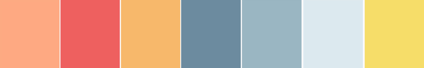
Key Color Themes & Design Layout | Time to put my design and color matching skills to the test. My color inspiration stemmed from the Bay Area where this company first began. I grabbed images of the harbor, the surrounding reservoir recreational area and the urban scene. I played with hex color codes and pushed pixels around until I found a series of colors I loved for this design. I kept the design clean and simple, using a grid to keep my layout organized.
Product | The outcome did exactly what I hoped it would, an optimized product page design and an awesome home page design that represents the culture of the company. All of this tied together with a category page, a checkout page and most importantly the community blog pages.

Lessons Learned | With so many important layers to this site, I needed to identify what information mattered most to shoppers and in terms of layout, place them in the most visible locations on the product page design. I learned a lot about the e-commerce fold line and its relationship with placing the items that customers care the most about. This is a great way to grab the attention of the user and keep their interest.
projects