Title Design
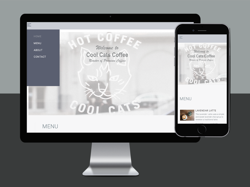
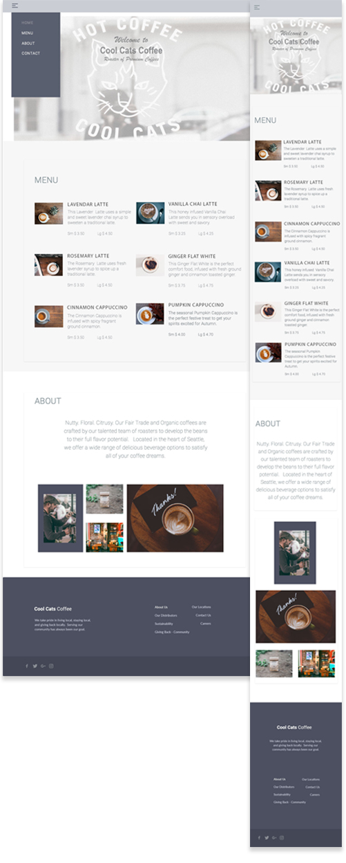
A look at the thought process | The folks at this little Seattle based coffee shop claim their coffee is "not your average caffeine fix." I wanted to capture just this in the product page. Beginning with attractive, high resolution images of their unique flavor selections, which all happen to have really origional names. I wanted this site to not only display the creatively designed "coffee art", but to also tell the start-up story of this small company and where they came from.
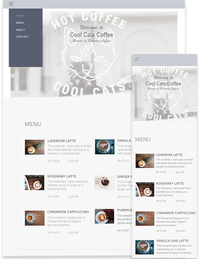
Identifying Challenges | My goal for the project was to make the design as simple and untraditional as its coffee products, with names such as the Lavendar Latte, the Rosemary Latte and a Ginger Flat White. The products can be described as nutty and floral, and are hand crafted by a team of roasters. This coffee company can be described by what coffee dreams are made of, and these are all of the things I wanted to communicate through my design efforts.
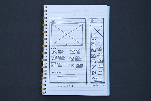
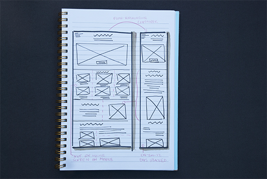
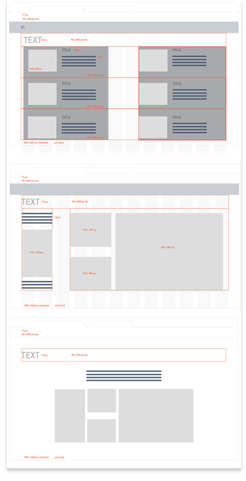
Design Thinking, Planning and Wireframing | I moved on to the development of service blueprints and a website blueprint. I considered layout for both web and mobile, and decided to center-align product text to give balance to the design. I had an urge to splash high resolution photos of the shop all over this site because the location is such a unique spot, but I knew I needed to be selective and not diffuse attention away from the product. This one-page site was going to be small, so organization is always key. I wanted to focus on a strong navigation menu that clearly informs users (and search engines) how to navigate around intuitively. I also focused on subtle animations that I wanted to incorporate into my design. On the product page, I envisioned hovering over an item on the menu to view an explanation as to what differentiates this product from others. I also wanted to use hover to inform the user about what makes each coffee variation special in an effort to focus on the distinctive qualities of the company and its products.
Key Color Themes & Design Layout | When I think of Seattle, I think of cool blues, misty fog and greys. When I think of coffee, I think of a blend of warm light and dark browns. I used these color concepts to create a minimalist design theme and color palette. After pushing pixels around in Photoshop, I cleaned up and simplified site layout with my mind on a grid and dimensions.

Product | The landing page showcase image provides the user with the sense that they are physically at the shop, peering into the window from the street. Throughout the site, hover effects offer product descriptions, and explanations of what differentiates products and ingredients from competitors. The cool Seattle color palette ties the site together.
Lessons Learned | When working with a very common product (such as a coffee shop in the Pacific Northwest) where they are sprinkled on every corner, it is important to find creative and unique ways to help the product page stand out from its competitors. This can be subtly done with the use of animations, or more visually with colors and images.
projects