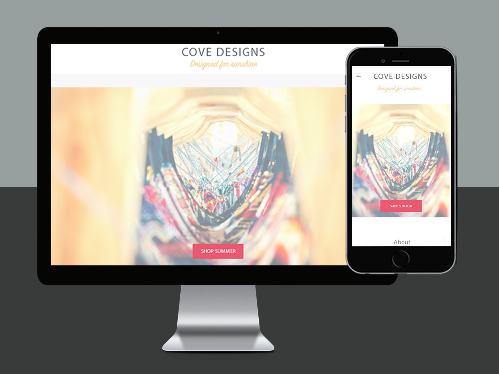
Cove Designs
A look at the thought process | This was an especially fun design process for me, mainly because I got to channel my inner love of California all over this design. A friend that opened up a pop-up shop in San Diego asked for my help, and I couldn’t resist. I wanted this to be beaming with California sunshine; sunny, bright, user friendly and simple.
Identifying Challenges | I knew I needed to set this layout up with the intention to convert visitors into customers. I wanted to accomplish this by designing the site in such a way that spoke to the clothing style, delivered an explosively colorful design, but still kept design aesthetics to a minimal for a strong focus on content and clothing products.
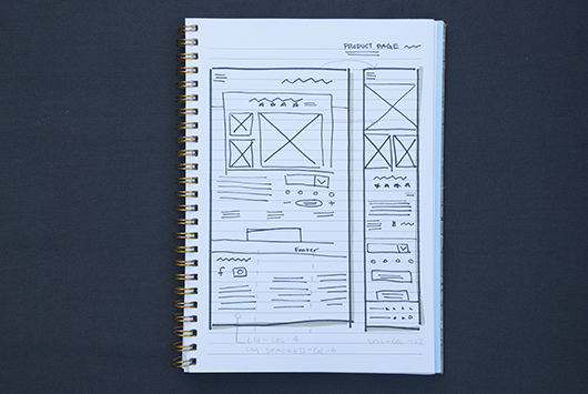
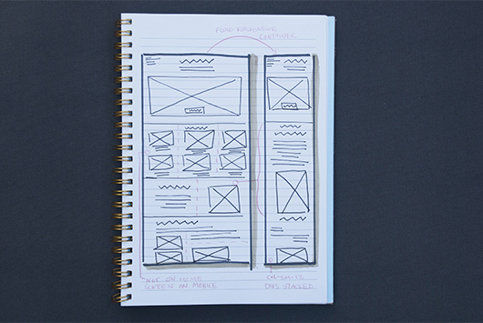
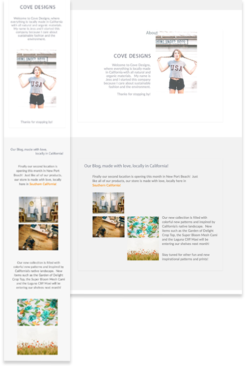
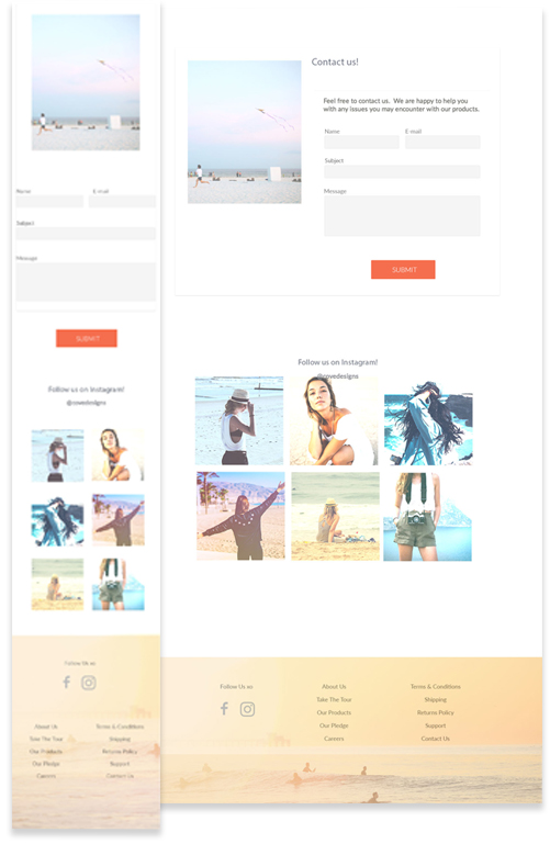
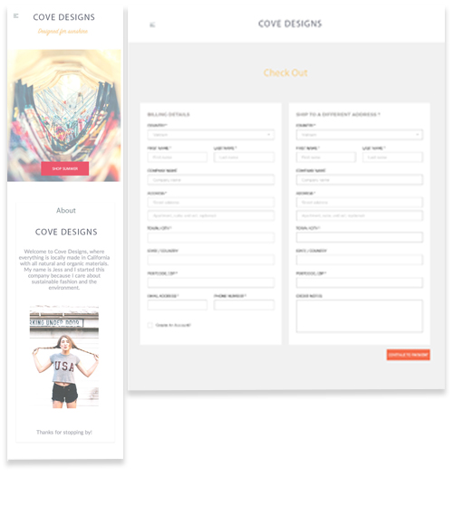
Design Thinking, Planning and Wireframing | Time to sketch through user flow and service blue printing. Being a new business focused on appearances, social media was a must. I also wanted to ensure that there was a designated space for the story of this company as it is a unique one, so ethnographic research was necessary. And of course plenty of responsive flexible fluid photos to help showcase products, allowing the store and the clothing to sell itself. I felt it was important to offer the user the option of seeing every product on one page, and I wanted the online shopper to feel the same experience as the in store shopper. I decided to set my mobile font no smaller than 16px in size, and also center-align text to balance out the design.
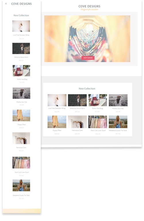
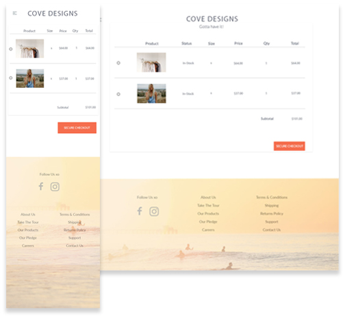
Key Color Themes & Design Layout | I couldn't wait to get creative with colorful user interface components to help shape their digital brand. I found the most iconic California sunset pictures and took them straight into Photoshop, grabbing hex color code numbers from each of my favorite pixels. I really wanted to instill in the user that this brand was a 100% locally owned California start-up. I decided to do this using the footer, making that visually a Southern California beach experience of its own. I cleaned up site layout and flow with my mind on pixels, dimensions, a California sunset and a grid.

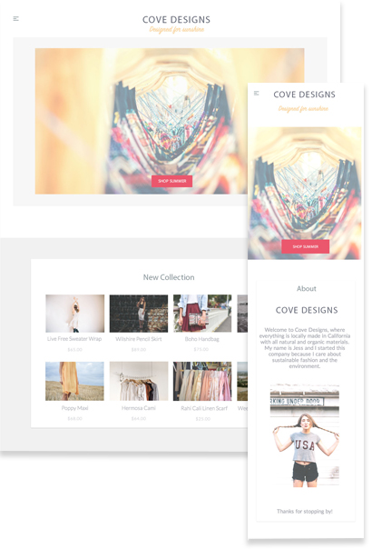
Product | As you can see, the product landing page and the footer leave the user with an overwhelming sense that they have just teleported to sunny California. Colorful graphics illustrate shopping tools and all call-to-action elements. Also, notice how there's plenty of white space surrounding the product images and descriptions. I aimed to keep this colorful site as simple as possible in an effort to not take away from product images and details.
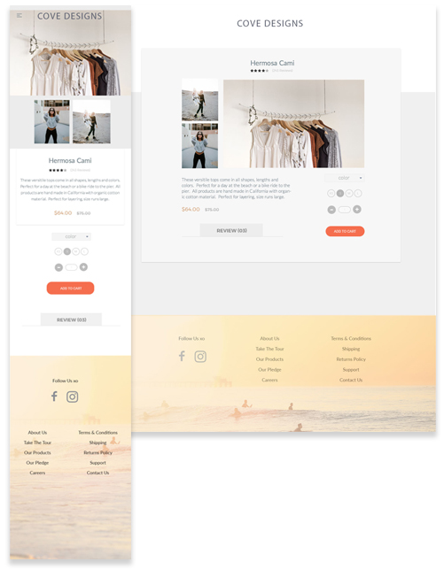
Lessons Learned | E-Commerce sites can have an overwhelming amount of product pages. There can be an individual product page for every item carried, with additional pages which can include all the information a customer could want, such as images, measurements, fabric, price, and reviews. There are so many layers, for design and development purposes it would be essential to take a modular, flexible, maintainable and most importantly reusable approach. Lastly, with so many product pages, it is essential to keep user flow and the navigation structure as simple and consistent as possible.


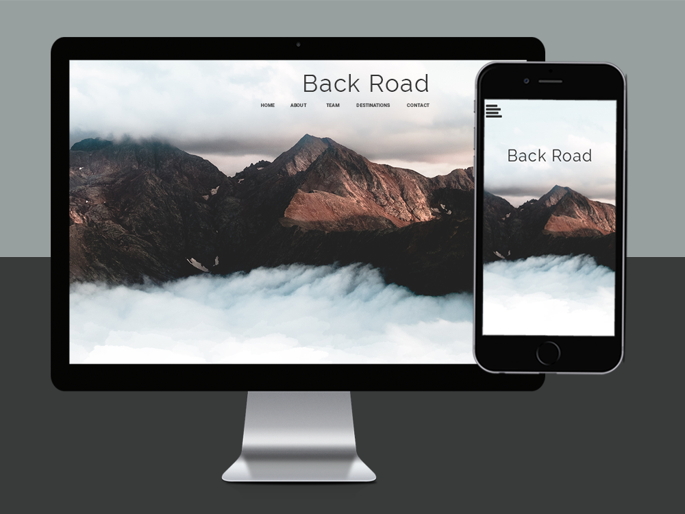
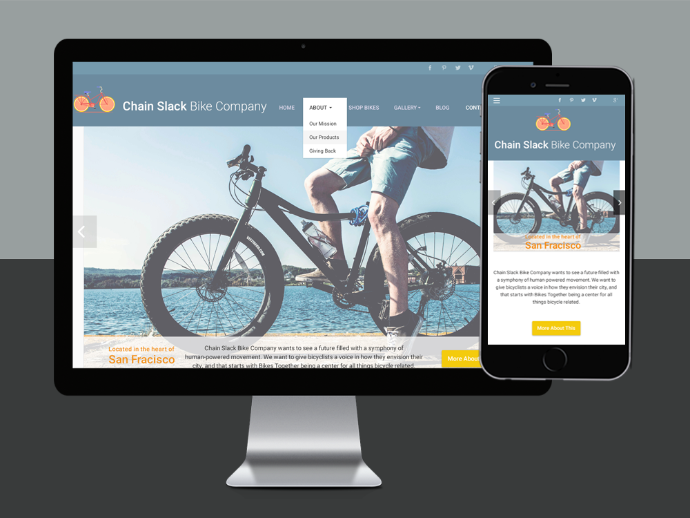
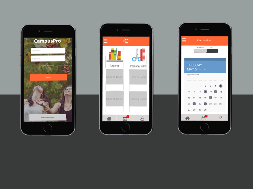
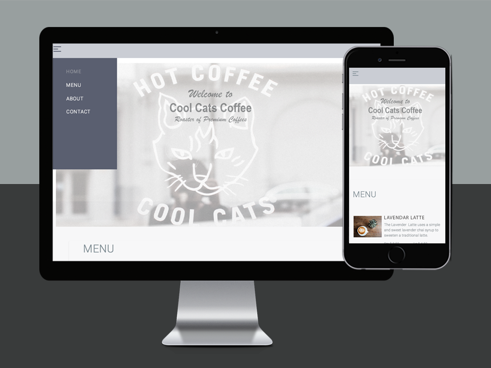
projects