Title Design
A look at the thought process | Prior to this, Canyon Fitness did all of their marketing through social media platforms. They firmly believe in creating life changing experiences through fitness and by people helping people. The small team consists of four friends that live a life of fitness, and enjoy teaching and training others. They push for a positive, encouraging and motivating experience in their fitness community and to help keep clients on track. Their workouts have moved from beach and hill workouts into a fitness studio, and as they continue to grow they became overdue for company site.
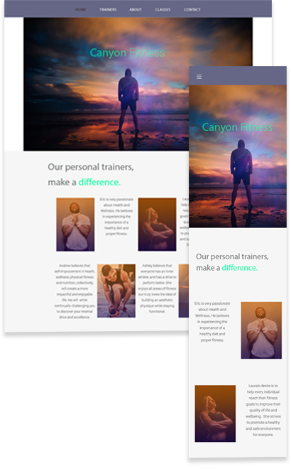
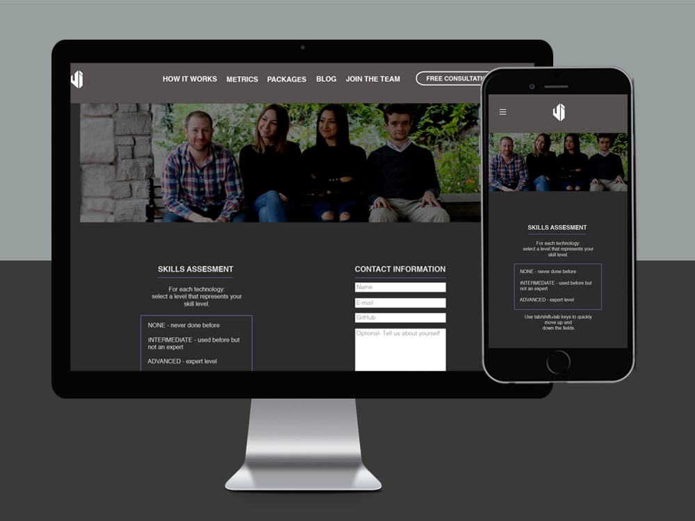
Identifying Challenges | I wanted to make sure that I told their story in the design, and also I wanted to get creative with a dynamic layout. This would involve CSS Flexbox classes instead of the traditional bootstrap grid layout. I also needed to include a form for prospective clients and business inquiries, and forms are never easy to make aesthetically pleasing. I knew I wanted to showcase and sell work-outs in the form of high resolution images, and I decided the application of a slider would be the best approach as a design solution.
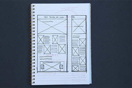
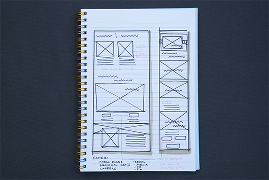
Design Thinking, Planning and Wireframing | Creating low-fidelity mock ups for this was a fun challenge because I really wanted to set this fun team apart from its competitors. I was generous with font and image sizes, and I decided to center-align all text on multiple devices to balance out the design. I wanted this design to be flexible and fluid, making the experience equally as unique on mobile, tablet and web.
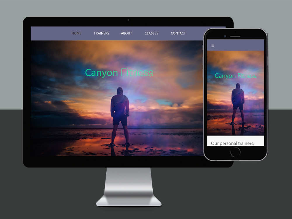
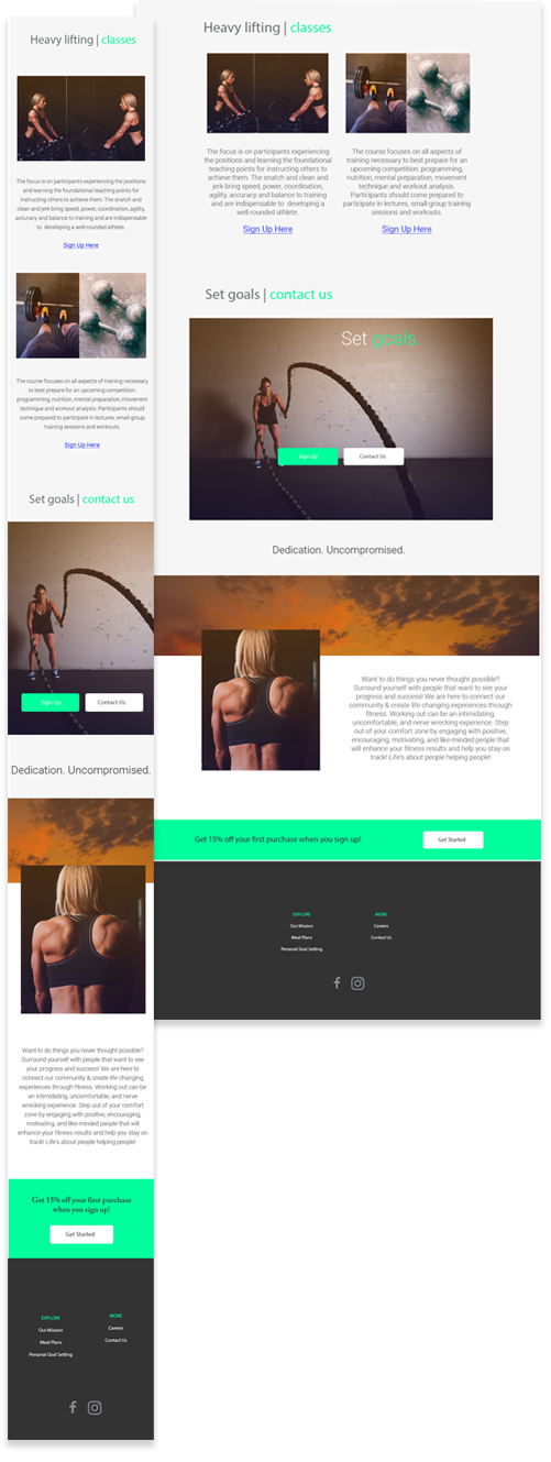
Key Color Themes & Design Layout | After I felt confident in the user flow on multiple devices, I got very creative with colorful user interface components. This is probably the most explosively colorful design I have yet to create. The Canyon Fitness team set on the color purple, but I stepped outside of this limitation. I took my inspiration from the colors seen in a dusty canyon. This involved looking up photos of the sun setting over the desert, and photos of the bright colored vegetation that pokes through canyon rocks. I collected a few photos from my travels and dragged those into Photoshop to begin experimenting with colors and pixels. I chose colors that represented canyon life, a mix of warm oranges and reds and a fresh accent of bright green for any call-to-action or important details. I tied everything together, staying loyal to the origional purple staple. As always, I tried to keep things aesthetically minimal in an effort to keep a strong focus on content and typography. I tired to keep layout clean, with my mind on dimensions, a grid and pixels.

Product | The product represents the team, the culture and the lifestyle that Canyon Fitness stands for. It is focused and user friendly, organized yet nontraditional in layout, and informative but leaves a bit of mystery about the team and what.
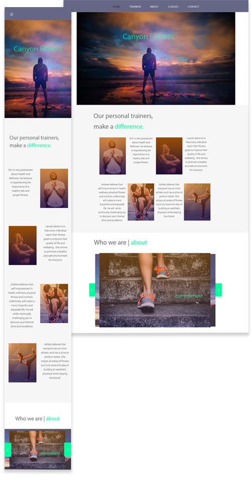
Lessons Learned | Located in an area with a lot of fitness options, I wanted this company to stand out against its competitors. My goal was to communicate personality while being relatable, be informative but also instill a sense of mystery. I wanted to encourage people to scroll through the site to find out more, and I achieved this by adding a bit of quirkiness and fun in an interactive sense. I found that a little friendliness and personality will make the process of signing up for a gym membership less daunting and a bit more enjoyable and human.
