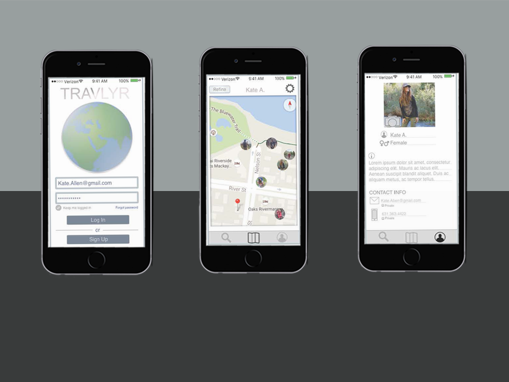
Skills Revamp
A look at the thought process | This was my first make-over, meaning taking an existing site page and making improvements. It was a fun experience because the problems were already established and I needed to focus on solutions and aesthetics.
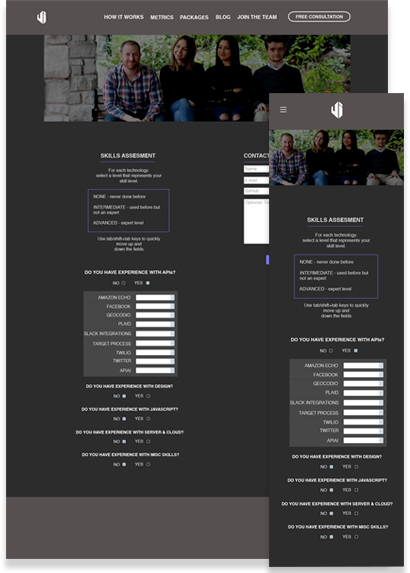
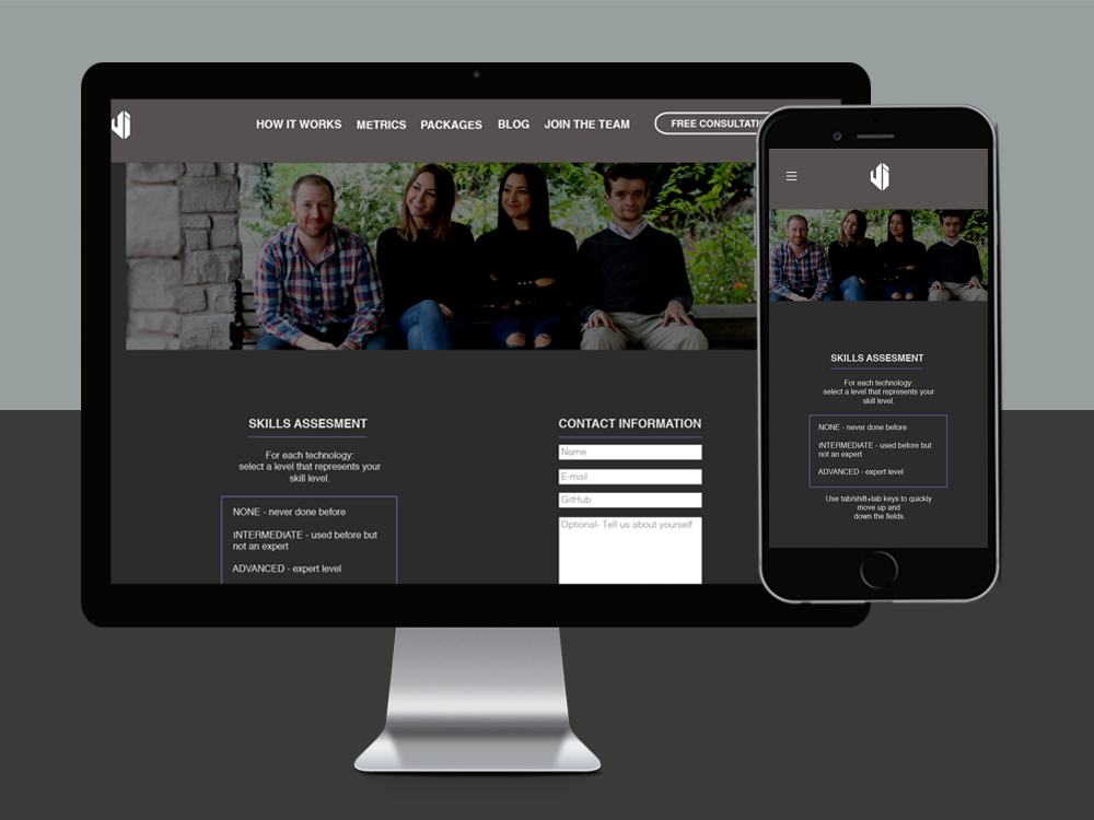
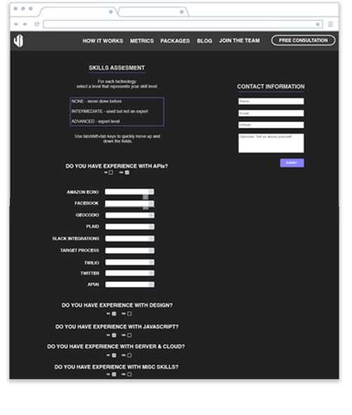
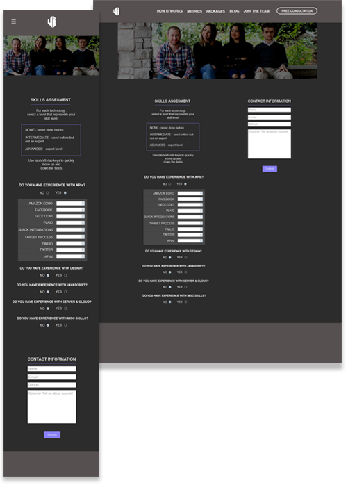
Identifying Challenges | Where to begin, as a designer the first thing that screams help are the aesthetics of this product as seen in the lower left. The purpose of this site is meant to encourage prospective employees to apply for a position at Upstate Interactive. The harsh colors and unintuitive user flow speak otherwise, so first things first I wanted to tone down and simplify what was existing as seen in the lower right example.
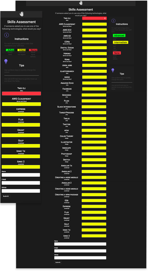
Design Thinking, Planning and Wireframing | Now on to the development of sketches and blueprints that focus on problem solving. In the existing model, every possible skill is listed out, but I felt the need to compartmentalize these and only navigate the user through each category if it pertains to them. This resulted in multiple iterations and rethinking the user journey.
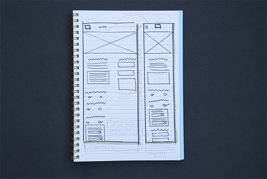
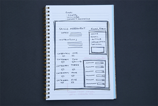
Design Thinking, Planning and Wireframing | Through a series of sketches and digital low and mid-fidelity wireframes, I was able to work with the team to come up with several viable solutions which diminished user pain points.
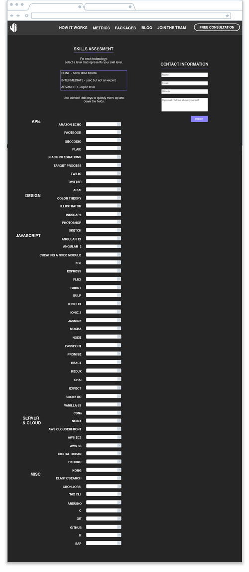
Key Color Themes, Typography and Design Layout | Because of the nature of this project, the branding and color theme were already in place. I identified what this was and held true to it, but decided to add a personal touch in the form of a showcase image. What better way to invite someone to join the team than by showcasing a large fluid responsive team photo at the top?

Iterations | Next comes the development of multiple website and mobile blueprints that worked well with the existing content. I had already identified that there was a need to compartmentalize skills, allowing the user to only navigate each category that pertains to them. This resulted in multiple iterations. I focused on cleaning up existing issues and simplifying layout with my mind on dimensions, pixels and a grid.
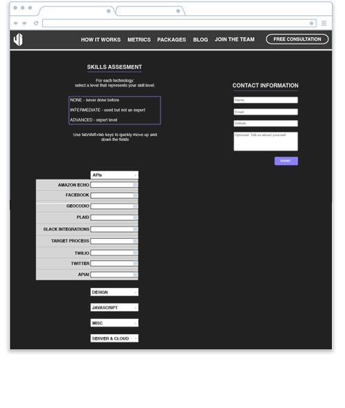
Final Product | I am happy to announce, we were able to compromise as a team and the end result was quite an improvement as seen below. The site was launched a week later and everyone is all smiles.
Lessons Learned | Working with an existing site was not as easy as I had anticipated. I learned that I enjoy developing my own branding as part of the design process and I do not like stepping on the toes of the first version developer. Mitigating strong personalities and getting a team to compromise was a fun challenge, and I think it helped bring the team closer together because the end goal is shared.
projects